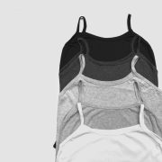
Dark or Light Garment?
For businesses aiming to maximize efficiency and reduce expenses, deciding the type of a garment to print on is a crucial step in the design and production process. Making these decisions early in the project is critical to the final outcome. For some companies, darker-colored garments may work best due to factors such as design specifications and brand identity. Dark garments like black or navy are universal and can convey a sleek, professional look. Additionally, darker garments are typically easier to clean and maintain from stains and perspiration.
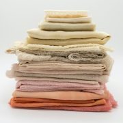
On the other hand, lighter garments have lower unit costs across suppliers and are more ideal for warm climates. Deciding whether to design for light or dark garments should be made during the design process. We will discuss design considerations later in the article, but first, here is some color and light theory:
Every color has characteristics that make it unique, and the effect that each one has is different. The photons that make up light and, ultimately, color cause a sensation in the eye. These photons reach the “rods and cones” of the retina inside the eye. The rods and cones then convert what they “see” into nerve information about color. The brain interprets the inputs of the optic nerves and makes sense of the information.
The brain processes the information and gives the resulting “colors” names, such as “blue” or “red.” It also interprets the lightness of the colors, meaning the shades or tints, sometimes (rather incorrectly) referred to as “luminance.” It simultaneously gives these colors, tints, and shades a meaning. Colors convey emotions, and ideas depending on their association; for example, in brand design, red often represents energy, passion and love while blue signifies calmness, trust, and stability, and yellow is associated with happiness, optimism.
- Red: Passion, love, energy
- Orange: Enthusiasm, creativity, warmth, fun, energy
- Yellow: Happiness, optimism, joy, creativity, caution
- Green: Nature, growth, harmony, peace, health
- Blue: Trust, calmness, serenity, stability, peace
- Purple: Royalty, luxury, mystery, power
- Black: Sophistication, professionalism, elegance, luxury
- White: Purity, innocence, cleanliness, simplicity
**Cultural variations: Color meanings can differ across cultures, so it’s important to consider your audience when using color symbolism.
**Shades and context: The shade of a color and its context can significantly influence its meaning.
**Psychological impact: Colors can evoke emotional responses and influence our perceptions.
Now that we covered some color theory below are some design considerations as it pertains to garment color selection and printing….
Design Considerations
The appearance of a design can vary significantly between light and dark garments, affecting how businesses approach their artwork.
Color Vibrancy
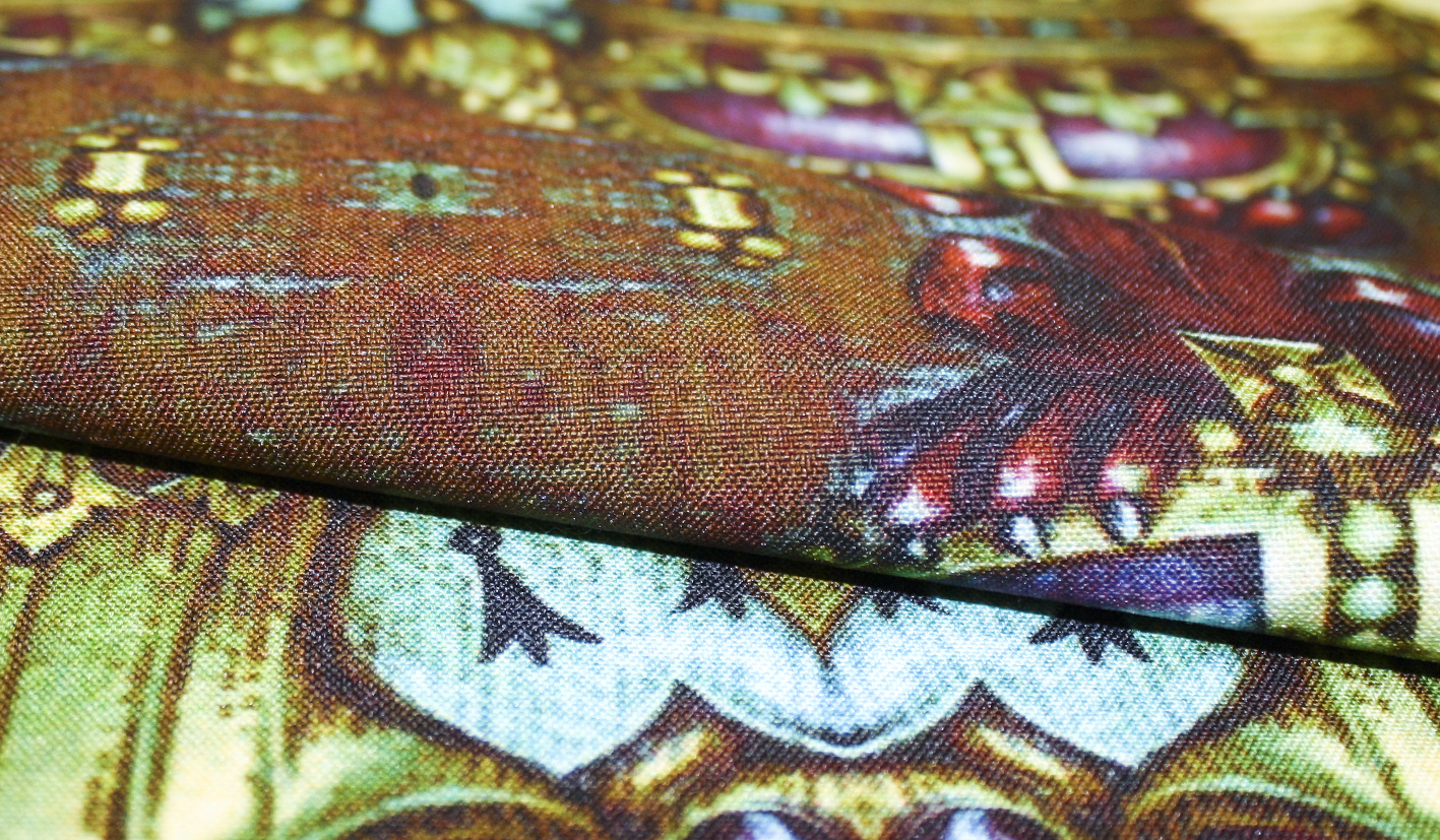
- Light garments: Without an underbase, colors remain bright and closely match digital design expectations.
- Dark garments: Applying a proper underbase ensures more accurate and vibrant prints.
Design Complexity
- Detailed artwork: Printing intricate designs on garments requires precise layering of ink and customization to maintain clarity and sharpness and may impact costs and print method.
- Contrast considerations: Light garments offer flexibility for subtle color gradients, while dark garments are optimized for vector and linear artwork to ensure proper contrast and readability. However, an underbase can be used to help support color gradients on dark garments.
Businesses should optimize their designs based on the type of fabric they are printing on to achieve the best results.
Contact our design team today for questions! design@spooler.co


 In similar style to how Netflix, Vimeo, and Spotify disrupted the film and music industries, Spooler aims to upend fashion. Customized, inventive, crowdsourced, and on-demand, the innovative company has been expanding with venture from business evangelist Dan ‘Zip’ Gould.